This web page was produced as an assignment for an undergraduate course at Davidson College.
Summary
The express goal of this paper was to use data collected in the field to more accurately represent the mutation rate of microorganisms in their natural environment. Many of earth’s geochemical cycles are performed by these organisms. These geochemical cycles are robust and can withstand changes, but how much of that change is accounted for by the evolutionary capacity of the inhabitants is still in question. Currently the bulk of our estimates are from information gathered on laboratory strains, endosymbionts and the discontinuous pathogens that are sequenced. Data from these derived strains may be skewed by many external factors and may not reflect the actual rate or scope of evolution of wild microbes.
To answer this question the authors selected an acid mine drainage (AMD) system that was “discrete, well-defined, and relatively homogeneous,” or in other words: a location suitable for only one kind of microbe. This AMD is known to be home to Leptospirillum, types 1 through 6. Previous work has shown that types 2-6 are early colonizers and type 1 is a late colonizer and that type 2 are the most dominant genotype. The researchers risked their lives to sample biofilms in this mine over 9 years from 6 different locations within the mine (Figure 1a).
They determined the base nucleotide substation rate to be 1.4 x 10^-9 substitutions per generation by tracking the genome change at one location for 5 years, a number which fit with earlier predictions. The authors then compared, using read recruitment of community genomic data, samples from different sites across the mine, and found that the Types 3, 4, 4a, and 5 were actually hybrids of type 1 and 6 (figure 2). The cells in each type had the exact same recombination point, suggesting that each biofilm consisted of the progeny of one cell.
The genomes of these different strains were then compared to the type 3 genome and a phylogenetic tree was constructed (Figure 2C). Using the substation rate given above and the information from the phylogenetic tree the common ancestor of these strains was suggested to be between 2 and 44 years.
Hybridization, which has occurred here, has been hypothesized to favor offspring in a changing, or adaptive, environment. The authors suggest that the mine is one of these locations because of periodic flushing. There is also evidence for positive selection of mutated genes and a disproportionately high number of several classes of genes, which they suggest is an important factor in ecological divergence (leading to speciation).
The implications of this work are astonishing: it has shown that in the period of only a few years or decade’s large evolutionary distance between closely related cells can emerge. This was a relatively closed system with only one inhabitant, which saw several divergences leading to a diverse set of competing flora.
Opinion
I thought this paper did a relatively good job in conveying its overarching points, but could be improved in several areas.
The authors did a very good job in setting the stage for their research. They did well laying out the Mine and showing spatially where they sampled. They also did well characterizing their subject, even though it is fairly confusing. However, I might have liked to see larger applications for the research-perhaps linking it to disease or human health. This would simply engage the reader on a more visceral, human scale; I believe leaving their research in the realm of microbial systems and geochemical cycles was a bit of an understatement. I believe they sold themselves short
The paper, itself was a strange read. Typically when I read scientific papers I am directed to the figures more often. As we have touched on several times in class humans are visual. I was struck by how much of the important data were in the supplementary figures, while they had two different panels in figure 1 discussing mine flow. For example I found myself wishing that I could see the evolutionary relationships of Leptospirillum more often. I believe they would have better served their purpose by showing us the different types of Leptospirillum as a first figure. Regardless, it is impossible to show all important data and I believe they did a fair job of condensing and choosing their results.
The figures themselves were tough. I mentioned that they condensed a lot of information down into this paper, but also that I did not see many references within the text. The text is where this information should be unpacked into a more basic format. The authors here were too lazy with their reporting. They left too much text in the figure legends and did not explicate well enough in the body of the paper. This leaves far too much information in the air; many readers do not have the experience or time to unpack it all.
I also found myself wondering what they were thinking when they created their coloring scheme in the in figure 1. For example Type IVa, V, and VI all had indistinguishable colors. Figures 2 and 3 did a much better job of using colors to their advantage.
![]() Example of Bad coloring scheme.
Example of Bad coloring scheme.
Overall I believed they did a fair job of reporting their work. I would like to see their figures edited in some important ways, and perhaps better better textual explanation.
As a side note I would also like to mention that I was surprised at the small number of cited articles, and that several of them (9, 12, 15, and 16) were papers by the first author. This does not detract from the main paper, but is an interesting fact.
Figures
Figure 1
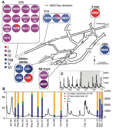
Panel A: Panel A is a schematic diagram showing us temporally (the dates within and above the circles) and spatially where the samples were collected. The grey arrows show the direction of flow and the colors within the circles depict what strains were found in which sample.
Panel B:
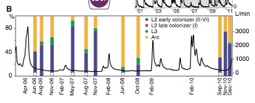
This shows us the flow rate within the mine as well as the community composition at the C75 sampling site. The community composition was determined by florescence in situ hybridization (FISH). The Y-axis left shows the percentage of which type is present (the color key is different than the one above and located in the top right of the panel). The Y-axis right shows the flow rate. The X-axis shows the date.
Panel C: This panel is the flow rate of the mine, this data gives us important information regarding the flow rate for determining turnover of the community.
Big Picture: This image’s job is to lay out the mine to the reader (Panel A), to show that there is high turnover rate (Panel B and C) and to show that the community composition is always in flux and skews toward early and late colonizers in a flow dependent manner (Panel
Figure 2:
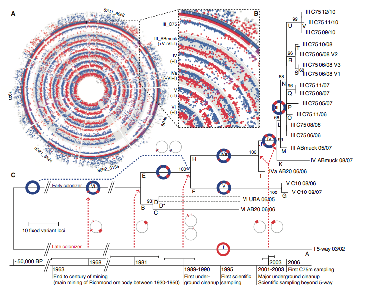
Panel A:
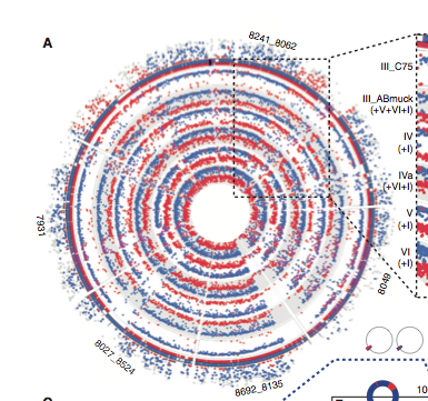
This figure is showing us the relationships within the type III strain. The outer circle of the plot counts the number of peptides unique to each strain within the Type III strain. The red dots represent Type I unique peptides and the Blue Dots represent Type VI unique peptides. The inner circles show illumine read recruitment to the reference genomes of the other recombinant strains.
This image shows us that the other strains are all hybrids of type 1 and 6.
Panel B:
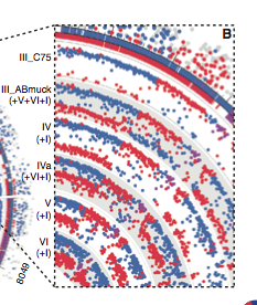
this panel zooms in on a location that is a recombination point (similarity between both strains).
Panel C:
(refer to top)
This is a phylogenetic tree created using the Type III genome. The dotted lines are recombination events and the circles show the genome regions affected. The lines below are the suggested timing of divergence of strains.
This phylogenetic tree was created using the maximum parsimony method. The bootstrap analysis is shown next to associated branches.
Big picture: This image shows us the similarity between the different strains and gives is the evolutionary relationships between them. Using the read data and the probable recombination locations a phylogenetic tree is constructed
Figure 3:
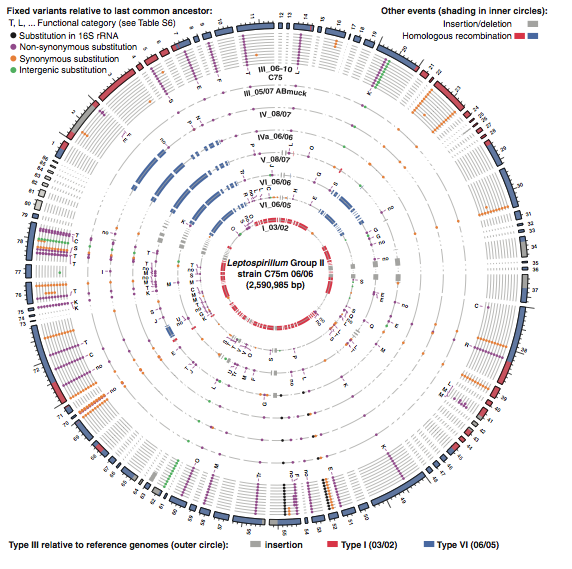
Figure 3: this figure is a representation of the group II High-frequency variants based on read recruitment to the C75 June 2006 type III genome. The dots indicate variant nucleotides relative to the last common ancestor of type III and VI. Each concentric circle represents a different ancestor or strain, and each different group of circles represents a different strain. Each nonsynonymous substitution has its functional category marked to show possible selection (only the most recent is marked).
Big Picture: This figure is meant to show us that certain groups of genes were mutated at a higher level than others possibly suggesting positive selection toward functional category T and K (Signal transduction and transcriptional genes respectively)
References:
Denefl, J.Vincent and Banfield, Jillian F. 2012. In Situ Evolutionary Rate Measurements Show Ecological Success of Recently Emerged Bacterial Hybrids. Science 336:462-467.