This web page was produced as an assignment for an undergraduate course at Davidson College.
The goal of this study was to determine rates of bacterial evolution in a natural environment. The earth’s geochemical cycles are driven by microbial communities, that change rapidly, but little is known about the proportion of that response that can be attributed to evolutionary processes versus gene expression shifts and species composition. There is limited data on how quickly free-living micro-organisms evolve because most studies are done in laboratories or restricted to natural populations of pathogens and endosymbionts. Therefore, the authors attempted to measure evolutionary rates of biofilm populations in a natural microbial community over time. In a time series study to track genome changes the authors studied a small species population located in an isolated but humanly accessible environment.
Biofilms of Leptospirillum group II, whose genome had been reconstructed for genotypes I and VI in a previous study, were collected over 9 years in an acid mine at six underground locations of intervals of 3 weeks to more than 1 year. A single-nucleotide substitution study was performed at a location that was dominated by one genotype of Leptospirillum group II and was used to estimate the nucleotide substitution rate of 1.4 X 10^-9 substitutions per nucleotide per generation. In addition, nine biofilms from different locations of other Leptospirillum group II genotypes were sequenced and analyzed in comparison to type I and VI reference genomes to construct a lineage history. Six genotypes were found to be a mosaic of type I and VI genomes with exactly the same transition points between recombinant blocks. This indicated that a major recombinant event occurred in a single cell. The dominant genotype among the populations differed only by a few nucleotides suggesting that increased fitness is due to adaptive SNPs.
In summary, the authors found that major selection episodes resulted in the formation of six genotypes differing by a few SNPs at the same recombinant location. The rate of nucleotide substitution was higher than expected despite the similarity between genotypes. However, it is indistinguishable whether human or natural factors mediate the selection process.
Overall, I think the authors provided a substantial background and description of recombination events occurring in the Leptospirillum group II population. Figure 1(A) provides a clear visual representation of the acid mine and the studies’ collection points and locations. However, the colors used to represent the proportion of the genotype in each sample taken are too close in pigment and make it hard to conceptualize population ratios. At the C75 location it is extremely difficult to see the small portions of genotypes V, IV, IVa, and VI that are present. As a result, there is a gap in understanding the data presented in the preceding figures. Nevertheless, the colors do provide a powerful statement about the dominance of genotype III in the acid mine population. The authors do a good job at addressing external factors such as, water flow and natural and human disturbance that could change population dynamics in Figures 1B, 1C and the text. This prompts the reader to examine the figures more closely and consider limitations and be skeptical. Therefore, the authors attempt to provide more evidence in support of their results. In addition, Figure 3 is a convenient way to show recombination between the different genotypes. At first glance the figure is daunting, but easily explained by the figure legend. The use of colors makes the recombination event and location clear.
The analysis of sequence recruitment data provided fascinating results, but unfortunately, Figure 2 by far was the most difficult to understand. The genome map comparing each genome of genotypes present at C75 to the two known reference genomes is overwhelming and difficult to follow. The text provides little information regarding sequence analysis, construction of the phylogenetic tree and explanation of what the figure represents. With limited explanation of the figure it is difficult to decipher what type of recombination events occurred between the early and late colonizer. The timeline of historical and ecological events are helpful but overall distracting, as the authors note that there is no way to correlate external events to recombination events. The text is both vague and confusing concerning the context of the figure and the reader needs information from Figure 3 to understand the branching of the tree. I suggest that the phylogenetic tree should be a separate figure after Figure 3 to diminish the overwhelming nature of the figure and provide a more comprehensive flow to the argument.
In the conclusion the authors state that they cannot conclude whether major selection episodes are mediated by natural or human factors, but Figure 2 and the text leading up to the conclusion indicate that external factors do contribute to variant events. I agree that there is an inability to determine what mediated major selection events, but suggest that this is not the major result of the study and that attention to it distracts the reader from the purpose of the paper and what the data presents.
The figures of the paper cannot easily stand-alone and need detail descriptions from the text in order for the reader to understand the results. However, the text devotes little space to explaining the data presented in the figures, but instead focuses on conclusions made from supplementary figures disrupting the flow of the argument. The figures serve as a visual basis for different genomes present in the population, but neglect to show how the they connect to the numerical findings the authors claim are most relevant to understanding bacterial evolution. The order in which the figures are discussed is out of order and constantly makes the reader flip back and forth between pages to piece together the argument. The authors claim that their results show that one major recombination event occurred and was selected for in descendent genotypes, but neglects to state what the major recombination event is. Overall, the paper provides a substantial background for the reader, but the paper is disorganized and the argument is in-coherent.
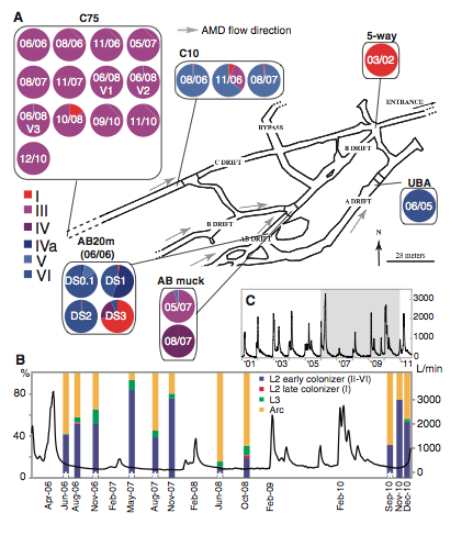
Figure 1. Genotype proportions of biofilms collected from six underground locations between March 2002 and December 2010 at intervals of 3 weeks to more than a year (Premission Pending).
Panel A
Above is a schematic map of Richmond Mine, indicating the 6-genotype proportions in 24 samples from read recruitment analysis. Locations were picked based on conditions that limit human endurance and are accessible at times of the year, which flow rates and danger of underground collapse are low. Arrows on the schematic map indicated direction of water flow and circles with dates represent the number and time of collections that occurred at the site. Location C75 shows the turnover rate of genotype III for rate of nucleotide substitution in a minor study to estimate substitution rates. Determined by Illumina sequence reads there is a high prevalence of genotype III throughout the study site and suggests that genotype III is the dominant genotype of the population in particular, dominating the upstream communities.
Panel B
The purpose of this panel is to show the flow rate measured at the mine entrance in relation to the percent composition of the 6 different genotypes and two ancient ancestors at the C75 location measured by fluorescence in situ hybridization. The x-axis is the date of sample collection at location, the right y-axis is flow rate in L/min during each collection, and the left y-axis in the percent community composition of Arc, Archaea, L3: Leptospirillum genotype III, L2: Leptosprillium genotype I-VI. An asterisk inside Leptosprillium genotype I-VI indicates the transition between Leptosprillium grenotype I-VI and Leptosprillium genotype III revealed by SNP analysis. There is no correlation between water flow rate and difference in genotype percent composition, suggesting that colonization rate is not affected by changes in water flow.
Panel C
The panel indicates the flow data from the entrance of the mine between 2001 and 2011. The shadow indicates the period displayed in panel B. The x-axis displays the time in years and the y-axis displays the rate of flow in L/min. There is a peak in the flow rate in 2006 and 2010. There is a decrease in flow rate between 2007 and 2008. Therefore, the landscape changes as result of environmental alterations varying seasonally and from year to year.
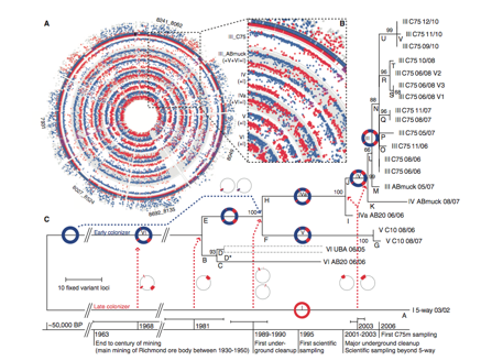
Figure 2. The reconstruction of Leptospirillum group II evolutionary history (Premission Pending).
Panel A
The purpose of this panel above is to compare the genomes of each genotype at the C75 location to the reference genomes type I and VI. The two outer circles plot peptide counts unique to the two references genomes: type 1 (red) and type VI (blue). Dots in the inner and outer circles represent a protein locus of the C75 population that is homologous to type I, VI or both at the same nucleotide position from Illumina recruitment reads. The genome map indicates that each genotype at C75 derived from the recombination of genotypes I and VI.
Panel B
The purpose of panel B is to show identical recombination points in all genotypes. The inner circles represent individual or combinations of genotypes III, IV, IVa, V, VI of collected at C75 with dots showing homologous protein loci to reference genomes. Genotypes collected at C75 have three common recombination sites (one blown up in panel B and the others seen in panel A) on the protein level (dots in purple). This indicates that a single recombinant event occurred and was selected for in future descendants, further supportive the hypothesis that the current population evolved from the combination of type I and VI genomes.
Panel C
Panel C shows the evolutionary history sampled genotypes at different time points and locations, based on variant loci deviation. Each position in the type III genotype genome where fixed a mutation was identified a phylogenetic tree was built off Illumina read recruitment and PIGT data. Bootstrap test values are shown next to branches representing the percentage of replicate phylogenic trees, in which taxa are clustered together. The base of the phylogenetic tree is a timeline of time ranges of recombination events in comparison to human and natural disturbance. Dotted arrows show combination events that lead to the branching. Branch D is presented as two strains each with the number of SNPs assigned to that genotype because of low incidence of SNPs preluding their linkage.
Starting roughly 50,000 BP (years before present) an early colonizer with type VI genotype evolved on site. From 1963, when a late colonizer emerged on site (type I genotype) to the present there have been major additive recombination events (dotted arrows) that lead to the emergence of genotype III. From the emergence of genotype III small variants have occurred supporting the high estimated nucleotide substitution rate of 1.4 X 10^-9 substitutions per nucleotide per generation. In addition, the branching pattern from branch C to branch E and F suggest a positive selection for mutations specific to certain genotype populations overtime, which could explain the present dominance of genotype III.
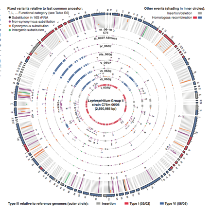
Figure 3. Genome map comparing geotype III to refrence genomes I and VI and other genotypes at location C75 (Premission Pending).
The figure above seeks to show how high frequency variants of the different genotypes evolved. The genome map represents the high-frequency variants of group II based on read recruitment of type III genotypefrom location C75 on June 2006. The outer ring is the genome of genotype III with color shading indicating similarity and differences from reference genomes type I (red) and VI (blue). Each inner circle compares the genomes of the different genotypes to type III genotype collected a different time points at the C75 location. Dots in circles represent variant nucleotides relative to the last common ancestor of type III to VI. The color of dot corresponds to a what substitution makes a certain variant. Red and blue shading in the inner circles represents homologous recombination and gray shading represents insertion/deletions between genotype III and other genotypes found at C75. Variants of genotype III from reference genomes type I and VI are seen in the same location for all genotypes identified at the site. This further provides evidence that a major recombination event occurred in a single cell and its decedents retained that variant. In addition, it indicates that genotype III is the most recent common ancestor of which all other genotypes except I and VI are derived from.
Denefl, J.Vincent and Banfield, Jillian F. 2012. In Situ Evolutionary Rate Measurements Show Ecological Success of Recently Emerged Bacterial Hybrids. SCIENCE 336:462-467.
Genomics Page
Biology Home Page
Email Questions or Comments to cadoyle@davidson.edu
© Copyright 2013 Department of Biology, Davidson College, Davidson, NC 28035