Volume 17 | Issue 17 | 56 | Sep. 8, 2003
The charge that scientists are bad writers is hardly an aphorism. Just read any scientific paper outside of your field and you'll quickly be lost in a jungle of jargon and poorly explained concepts. Yet most scientists struggle mightily with wordsmithing, some going so far as to hire consultants, because they understand the importance of a well-written manuscript.
The same does not always apply to illustrations, a catchall term for all graphical representations of scientific data, including diagrams, charts, and graphs. "The state of scientific graphics is very poor," says Tom Lang, coauthor of How to Report Statistics in Medicine; Annotated Guidelines for Authors, Editors and Reviewers.1 "Too little forethought goes into the illustrations, which are probably the most read part of the paper."
While the science comes first and the writing is clearly important, charts and graphs can make the difference for your paper. "If it's spectacular science, an editor will find a way to get it in the journal," says Barbara Gastel, editor of Science Editor , a journal published by the Council of Science Editors. Most papers, Gastel says, present neither great nor bad science. "An editor will choose to publish the mediocre paper that's well presented over the mediocre paper that's been shoddily put together every time."
Some scientists have heard that call loud and clear. Gabriella D'Arcangelo says that she spent more than half her preparation time on illustrations for a recent neurobiology manuscript. "I felt that if it didn't have good illustrations it would affect the decision to publish," says D'Arcangelo, whose paper was published in Science. 2 "And I don't think I was wrong."
Editors agree. In a recent survey in Science Editor , 16 of 25 editors said that the quality of graphs was a criterion for acceptance of the paper, while 21 editors described a decline in the quality of graphs in their journals over the last few years. 3 "There's been a revolution in computer tools that allows the average person to make high-quality graphics," says Katrina Kelner, an editor at Science . "However, at the same time, standards have risen. It's worth it for a scientist to take the time to get their graphics the best they can be." Today, Kelner says, her publication rarely makes changes to graphs and tables after digital submission. That makes it all the more important to get it right the first time.
Choosing the right tools is the first step, according to Kelner and other editors. "The market is flooded with computer graphics systems that cannot produce illustrations of publication quality," says a manual for authors published by the Council of Biology Editors. Pay the extra money for professional illustration software such as Adobe Photoshop.
GRAPHS AND CHARTS By no means should you resort to using the graph functions on Microsoft Word. The default options for that program are the two worst choices for displaying scientific data: bar graphs and pie charts (more on this later). Above all, take the time and energy to make good graphs and tables that communicate the data effectively.
At the beginning of the 20th century, scientists created micrographs using a camera lucida, a device that shined a projection of a microscopic image onto a surface. The image could then be reproduced on paper by tracing with a pen or pencil. The simple system portrayed large-scale cellular complexes relatively well.
Multimillion-dollar microscopy systems are now the standard. Some devices can reach the atomic scale, while others specialize in fluorescent imaging or three-dimensional imaging. Regardless of the equipment, most scientific papers are meaningless without their micrographs. Often, color is a vital part of displaying this imagery, especially when some form of luminescence is involved. However, color images usually mean higher page charges. "We spent almost $2,000 on our paper just for page charges, which is bordering on the obscene," say Cameron Patterson at University of North Carolina, Chapel Hill, about a paper he recently published.
Color is often necessary to see changes or differing cellular activity. In order to enhance the image, some scientists get very creative with their image manipulation software, which can lead to problems of scientific accuracy. In general, manipulation is acceptable as long as it aids the reader to see something that is visible in the microscope but is altered by printing the image on paper. You can, for example, change the color contrast slightly so that fluorescent spots are more apparent in print. If you find yourself adding things to the photograph, however, you've probably gone too far.
Most problems with micrographs are far more mundane. "If I had one complaint, it's that everyone forgets to add the scale bar," says Science 's Kelner. "They assume we'll add it in production. How hard can it be to put in a little scale?"
Sam Jaffe can be contacted at sjaffe@the-scientist.com .
References
1. T.A. Lang, M. Secic, How to Report Statistics in Medicine; Annotated
Guidelines for Authors, Editors and Reviewers, Philadelphia: American
College of Physicians Press, 1997.
2. E. Schofield, "Quality of graphs in scientific journals: An exploratory study," Science Editor , 25:39, March-April 2002.
3. G. D'Arcangelo et al., "Reelin promotes peripheral synapse elimination and maturation," Science, 301:5633, Aug. 1, 2003.
THE ART OF CHARTS AND GRAPHS
Tom Lang, coauthor of How to Report Statistics in Medicine; Annotated Guidelines for Authors, Editors and Reviewers , offers five tips to get your message across.
Figures should have a purpose. "Too often," says Lang, "Scientists view graphs and charts as a data dump." Instead, you should plan each figure as carefully as you've written the paper. If a figure is not necessary to tell the larger story of your research, don't include it. Instead, choose your figures based on their storytelling power rather than viewing them as the paper equivalent of a database. You should not view graphs and charts as passive repositories of data. "They should be telling a story, not holding your numbers," Lang says.
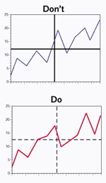
EMPHASIZE THE DATA, NOT THE FIGURE: The most prominent element of a figure should always be the essential data. That means you shouldn't bold the axis lines or borders in a line graph (top right). Instead, bold the data line (bottom, right), so that its prominence catches the eye.
The figure's purpose should determine its form. Don't choose the type of graph before you know what the data is. For instance, if you're trying to show data that has high correlation with a high standard deviation, use a scattergram rather than a line graph. And above all, don't use pie charts. "The human brain has difficulty determining angles and area simultaneously," Lang says. "That's exactly what the pie chart expects us to do."
Data should be emphasized over elements in the figure. The important point is to communicate the data to the reader, not to impress with a pretty diagram. A common misstep, according to Lang, occurs when authors bold the axis lines of a simple line graph. It's better to bold the data line and soften the axis lines. "Your eye automatically goes to the darkest object. That should be the data."
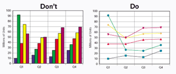
USE ONLY ELEMENTS THAT MAKE THE POINT: Bar graphs (left) some times are a no-no because they emphasize the size of the columns, whereas the only point that's important is the top of the bar. A Cleveland dot graph (right) might be a better choice especially for a time series. Bar graphs can be good for single time points.
The figure should contain only elements that make the point. Again, the message here is to not get too enamored of the artwork. A prime example is the bar chart, another of Lang's bugbears. Lang prefers the Cleveland dot graph, named after statistician William Cleveland. "It's much more economical and elegant, and it's a much better way to tell a graphical story without losing the reader in unimportant elements," Lang says.
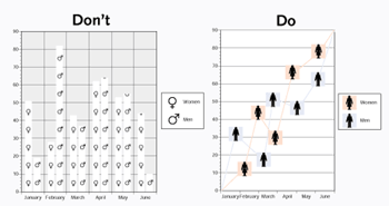
SIMILARITY AND SIZE AFFECT THE MESSAGE: Choose your icons carefully. Scientists often use the sex symbols in graphs meant to show the differences between men and women (left), for instance. Yet they are not easily discernible with a quick glance. Choose a more dissimilar icon (right). Also, size is a powerful signifier of importance. If your icons are too small (left), they won't communicate effectively. Enlarge them (right) and they can tell the story better.
Listen to what science has to say. Psychological studies have taken a lot of guesswork out of understanding how humans visually perceive things. Eyes are drawn to larger objects before smaller objects, so size your icons on a graph accordingly. Objects near each other tend to be seen as a group, so space your figures far enough apart to avoid confusion. The brain will fill in small gaps, so if you're changing axes or scales, make it easily apparent.