Appendix A
Beginners Guide to Using Cricket Graph
1) Double Click on the Cricket Graph icon that is in the "Bio111 Folder". If this program is already running, it will ask you if you want a data for graph format; choose the data format.
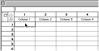
2) When Cricket Graph opens in the data format, you will see a spreadsheet like this one:
You can see the cursor is pointing to the first blank where data will be entered. Above that is the term "Column 1". Click once on "Column 1" and type in the word "Time" and enter "Abs. (-blank) where "Column 2" appears:
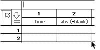
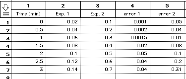
3) Now you are ready to enter your data. Put the times down the first column and your absorbance values down column two. If you have more than one experimental condition being tested, each condition should get its own column (be sure to name each one appropriately).
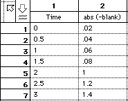
Potential Problem to be aware of: Cricket graph is funny in that it treats letters and numbers differently and it assumes what every you put in the first cell is what you want all other cells in that column to be (i.e. either letters or numbers but it cannot deal with a mixture). Notice in the example below there are two ways the numbers can appear:
In column number 1, the word "time was entered in cell number 1 which caused all the subsequent numbers to be treated as letters as indicated by their position on the left side of the cell. In column number 2, the word time was entered at the upper box above cell number one which resulted in all the numbers being treated as numbers, as indicated by their positions on the right side of the cells.
If you have this problem, delete the words, enter the numbers in the correct locations, and highlight all affected columns and "Apple F". You will see a dialog box like this:
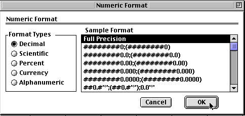
Select Decimal and click OK.
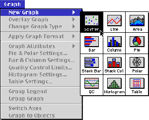
4) Now it is time to make a graph. Go the "Graph" menu along the top. Click and hold. Select new and then scatter:
5) You will get a options window like this:
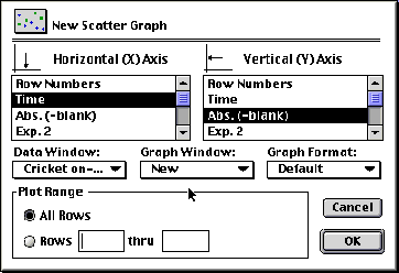
Select Time for the X-Axis and your data for the Y-Axis and click on OK. You will get a new graph.
6) You can change any aspect you want about the graph. All you need to do is double click on the part you want to change and select the correct options. If you want to change the text, then click on the "ABC" button of the tool bar and then click on the text you want to change.
Curve Fitting
7) I have changed a number of the options to improve the appearance of the graph. Now I would like to generate a best-fit line and have the equation of this line displayed for me. To do this, click once on the background around the graph until you see it outlined in black dots. Go to the Options menu and select Curve Fit.
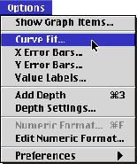
You will see an options window, select the following
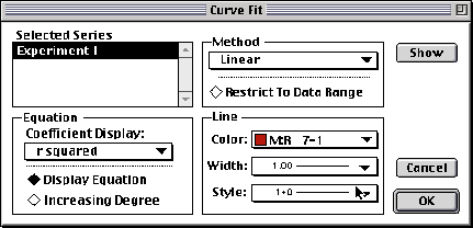
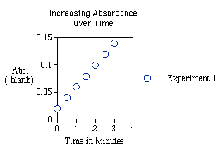
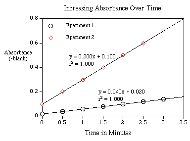
When you have done all this, click on OK and you will get something like this:
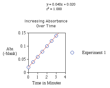
Since these data points are fictitious, you can see that they are a perfectly straight line. This is shown mathematically by the r2 value of 1.000. Your data will not give such a perfect value, but it will be something closer to 0.95.
The equation comes in the form of y = mx + b which you should recognize from early math courses: m = slope of the line b = the Y intercept.
The slope measures the change in Y as a function of X, or in our case, a change in absorbance over time. That is the definition of an enzymes activity so you can use this value to quantify how fast the enzyme was working in experiment 1.
Multiple Data Sets on One Graph
8) If you have several lines you wanted to graph all at the same time, you can do this two different ways.
If you already have one line and you want to add on others:
Click on the background of the graph until the black dots appear. Then under the Graph menu, select Overlay Graph. In the options window that will appear, choose the other Y-values you want to plot on the same X-axis.
If you are starting a new graph and you want to plot several lines all at once:
Under the Graph menu, select new. When you have the options window, choose time for the X-axis and click on your first data set for the Y-Axis. Then hold down the Apple key (ð ) and then click on other data sets you want to plot. When you have selected all that you want, click OK. You can then have each set fit with a line etc. as described in #7 above.
Error Bars
9) If you have generated a set of points and you would like to include error bars, this can be done easily. Let's imagine you have two experiments, each with its own error values. To graph these you need to first generate two lines as described in #8 above. Then go to the Options menu and select Y-error Bars.
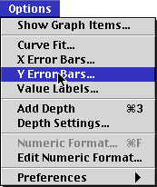
You will get an Options window and you should select:
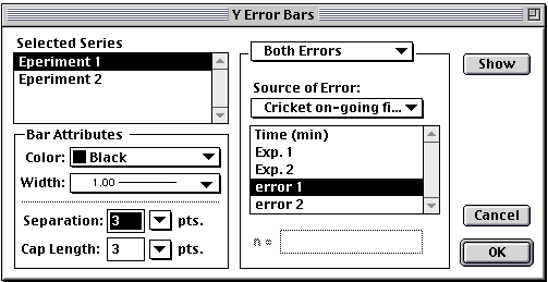
Click on OK and you will see a graph with error bars:
10) Finally, you will want to print this graph. If you are going to use the graph for an oral presentation in a room with a video documentation camera used for projection, then print the graph very small. If you are going to use in to make an overhead transparency, then print it large.
![]()
© Copyright 2000 Department of Biology,
Davidson College, Davidson, NC 28036
Send comments, questions, and suggestions to: macampbell@davidson.edu